2019 Art Series artist Michael Hacker tells stories through illustration
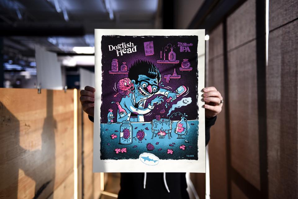
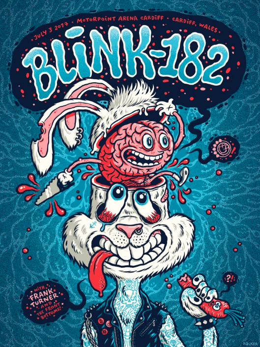
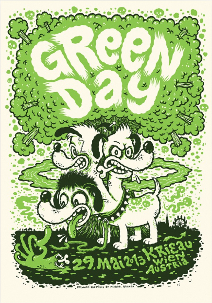
The Melvins, Green Day, Sonic Youth, Blink-182, Vice Magazine, Slash Snowboards ... illustrator Michael Hacker has created original artwork for them all. And in 2018 - 2019, Dogfish Head is lucky to have had him create four new original pieces for our Art Series beers: 75 Minute IPA, The Perfect Disguise, Dragons & YumYums, and Punkin Ale. 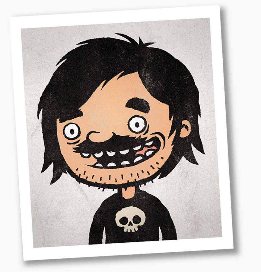
First up ... 75 Minute IPA. An off-centered combination of our 60 Minute and 90 Minute, this classic IPA brewed with maple syrup from Sam's family farm started shipping early October. The rest of Michael's illustrations - along with the Art Series beers - will follow in 2019 and once again, you'll see the work on labels, t-shirts, posters and more.
Get to know Michael in the interview below, and check out his killer portfolio here!
How long have you been an illustrator?
I’ve been working as a freelance illustrator since 2009. I started right after finishing art school. I’ve been doing gig posters for bands like QOTSA, Pixies, The Melvins, Fu Manchu, Mastodon, Green Day and many more since 2007.
We have a saying we use a lot to talk about our beer – "Analog beer for the digital age." – could you tell us a little bit about how you use analog and digital techniques to create your work?
A large part of my artwork is done in an analog way. It all starts with an idea and a very rough and small sketch on paper. After blowing it up and adding details I start inking with a brush pen by tracing the pencil drawing on a light table. As I often try to integrate typography into my artwork I do the lettering by hand as well. Usually I add the colours digitally or I draw the colour layers on transparent paper and put them together on the computer.
How is approaching posters based on beer brands different than, say, a movie, a band or a specific personality? Does your process change at all?
For me there’s hardly any difference. If the project or client allows, it I always try to tell a story with my illustrations. Instead of them being just decorative elements.
How much input do your clients give on content?
This varies greatly. Sometimes a client just tells me to do more or less whatever I want, and sometimes I’ll get a very specific and detailed briefing. If a client knows what my strengths are or why they have hired me in particular, I’m totally happy with both ways.
You’ve worked with a lot of big names, and at some point must have worked with bands or actors or directors that you really love. Do you ever step back, pinch yourself, and think, “Wow, it’s really cool to be a part of this creative world?”
Yes, sometimes I do have such a moment. For example, when I’m attending a gig poster convention like Flatstock. During the last years I’ve met tons of talented and great people, and made new friends all over the world. I was lucky enough to be part of such shows in Austin, Chicago, Barcelona, Hamburg or Istanbul. And I’m also lucky to be part of the ‘Isolation Camp’ movement. It's a regular gathering of artists from different genres in some remote hut in the (Austrian) Alps. One of the goals is to collaborate with other people instead of just work on your own. The outcome of these collaborations is always very refreshing. I've attended about ten of these camps and every one was really inspiring and memorable.
What do you like to play with when you’re drawing something? Composition, size, color … all of the above?
Ideally I have a pretty good idea what the finished illustration will look like after I’ve done a rough sketch. A lot of times the composition doesn’t change very much from there. In terms of color, I have certain ways of adding colors to my drawings. Partly influenced by my screen print work where I always try to reduce the number of colors I use. It seems to me that I don’t experiment so much nowadays. But once in a while I do play around and try out new things - like during those aforementioned ‘Isolation Camps’ for example.
Who do you admire in illustration, past or present, and why?
As I was heavily influenced by comic books, I especially look up to comic artists. Artists like Jim Woodring, Mike Mignola, Winshluss and Nicolas Mahler, just to name a few. Four totally different artists but each one with a very distinctive style that fits the sort of stories they tell perfectly. That's something I admire.
At Dogfish, we’ve learned to embrace the intersection of art (in liquid form) and business. Was that ever tough for you?
It still is to this day. But when I decided to become a freelance illustrator I knew that this is part of the deal and I’ve gotten better at it. And it can be fun as well. Back in 2017 I did my first crowd-funding campaign to fund ‘Pizzeria Disgusto’ - a cartoon book full of illustrated puns and wordplays about Pizza, Pasta and other Italian delicacies. I spent a lot of time doing research and calculating, which was very challenging for me. But the project was funded very quickly and I ended up with double the amount I was trying to raise. The kind of support I got from my fans was really overwhelming.
What’s the creative process? How do you work with the designers at Dogfish? How do you collaborate with Sam?
What I’ve really enjoyed with all projects so far is Dogfish Head’s focus on telling a story. Which is right up my alley. Behind every Dogfish Head beer there’s a great story that Sam wants to tell. All I do is try to visualize the story in my own style. I worked very close together with Dogfish Head’s design team, and I’m very happy about what we’ve come up with together.
Do you get to try the beer beforehand?
Unfortunately not. But I got a good description of the beers’ flavor profile from Paul of Dogfish Head’s design team and watching Sam’s ‘Quick Sip Clips’ was helpful as well.
What’s your favorite Dogfish Head beer?
That’s an easy question to answer as I have only tried one Dogfish Head beer so far - Liquid Truth Serum IPA. And it tastes amazing! Of course I hope to get to taste all of the Dogfish Head Art Series beers soon!
What was your inspiration behind 75 Minute IPA?
As 75 Minute IPA is a combination of 60 Minute and 90 Minute, I wanted to show the mixing process. I really liked the idea of a mad scientist and loved how it brought to life the idea of Sam being considered the original mad scientist of the early craft beer movement. The fake glasses and rubber nose disguise is a reference to the original 75 Minute label design. To make things a little weirder I added a brain whispering into the scientist’s ear as well as a Delaware Blue Hen watching the whole scene thirstily.
