Introducing our 2021 Off-Centered Art Series Artist, Ryan Besch!
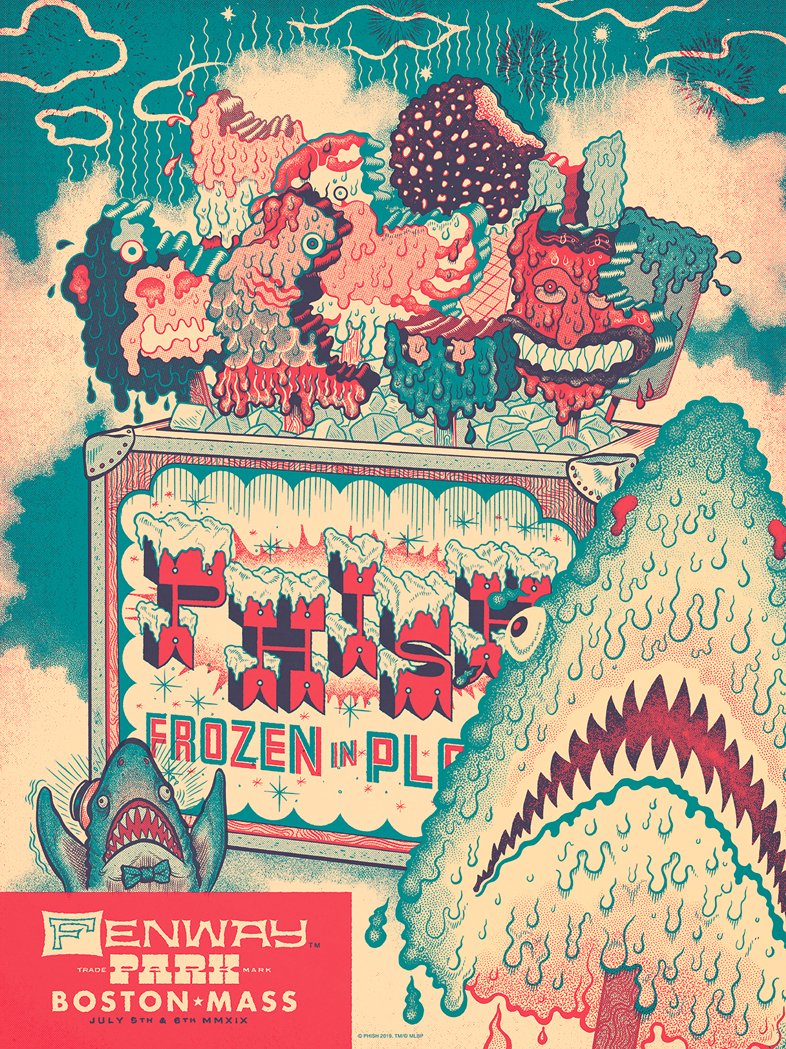
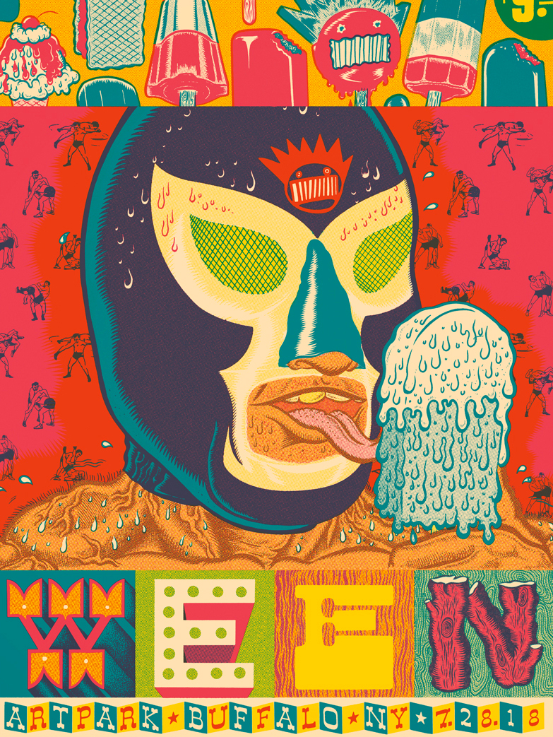
Our 2021 Off-Centered Art Series artist, Ryan Besch, has been designing notable gig posters and vinyl art for 20+ years for notable names such as Phish, Ween, O.A.R., the Black Keys, and a slew of others, now including yours truly .. Dogfish Head! Ryan is an artist, designer & illustrator from Buffalo, NY, who has created four new original pieces for our Art Series beers: Dogfish Head Camp Amp, 90 Minute IPA, Sun-Day-Feels, and Mango Smoovie.
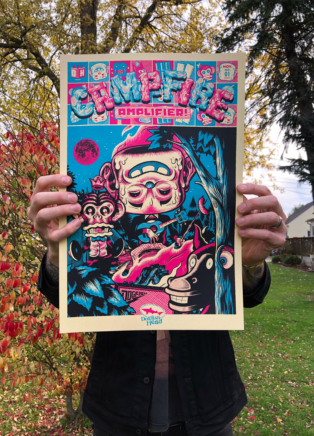
First on deck, Dogfish Head Camp Amp! This s'mores-inspired milk stout was inspired by cold nights around the campfire, and Ryan knocked it out of the park with his comics-inspired approach to this off-centered ale. Check out his signed screenprint here! The rest of his illustrations will start releasing throughout 2021.
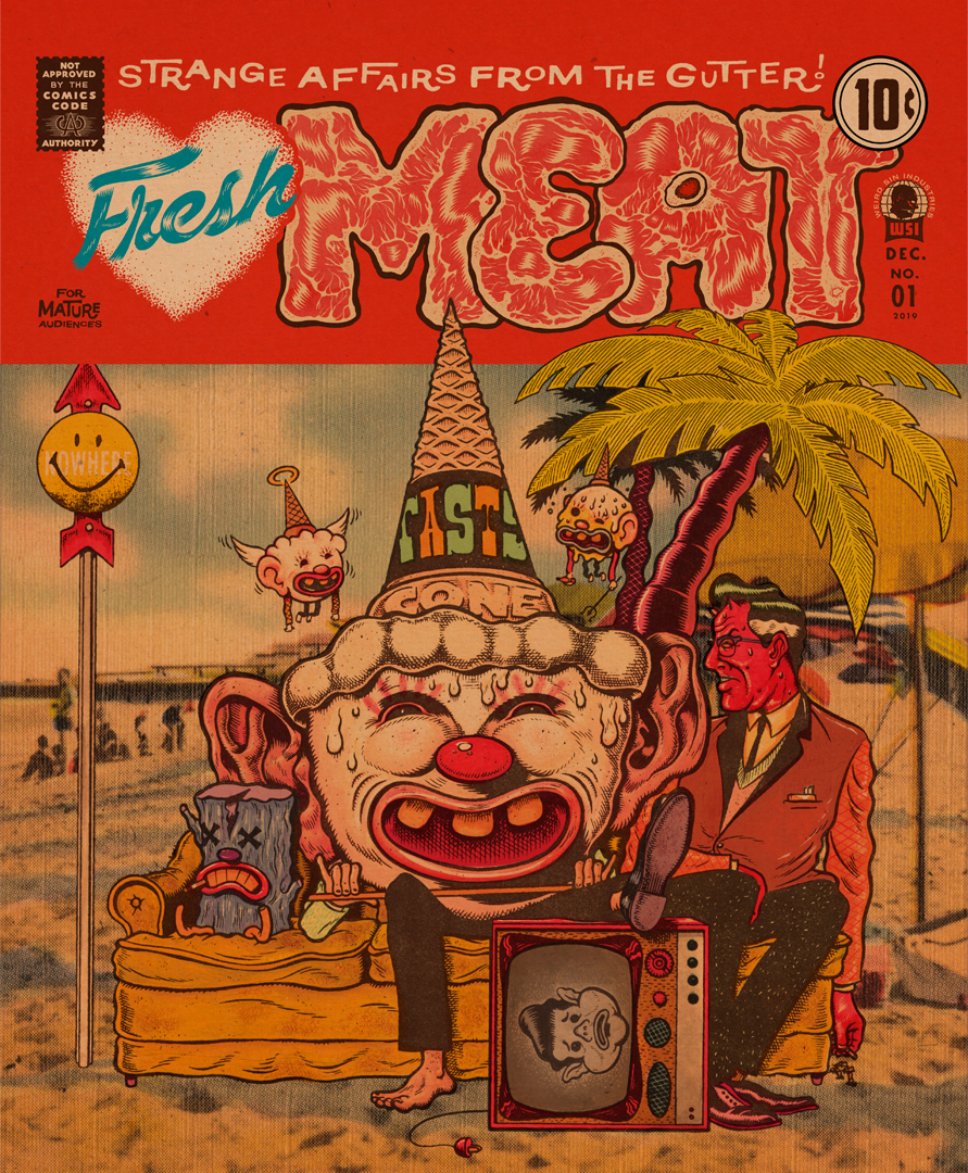
Get to know Ryan in the interview below, and don't miss his epic portfolio!
How long have you been an illustrator?
That’s a hard one. I was always drawing as a kid and all through high school, but at a certain point during art school, I became really influenced by collage and screen printing. This lead to a major focus on graphic design, collage / cut and paste being my main style. I sort of put drawing to the side for a long time, maybe a decade or so, and just focused on design work. Then around 2015, I slowly started picking up my brushes again, little by little. Since then, I’ve been working on it steadily, trying to find myself in it. With every new project I feel like I’m getting closer to finding a style that still retains my influences, but is filtered through me. It’s a constant process.
We have a saying we use a lot to talk about our beer – "Analog beer for the digital age." – could you tell us a little bit about how you use analog and digital techniques to create your work?
Almost everything I do, whether it’s illustration work or design work, starts in an analog way. If it’s design work, I’m probably photocopying images to death in order to collage them together, or if it’s illustration work, I’m creating all aspects of the illustration by hand (drawing, inking, gauche, colored pencil, etc). It usually isn’t until the last 30% of a project, where I’ll scan all of the individual pieces I have and start bringing them into Photoshop for coloring / texturizing / separations / etc. So ultimately, everything I do ends up as a marriage of an analog and digital process.
How is approaching posters based on beer brands different than, say, a movie, a band or a specific personality? Does your process change at all?
No not really. I feel like the main part of this job is always to try and tell the clients story as succinctly as you can. Get the idea across with as little fat on it as possible (even if it doesn’t appear that way sometimes with the amount that’s going on in my finished work). That’s just kind of universal no matter who the client is.
How much input do your clients give on content?
It really depends on the client, some give more than others. For the most part, they know what I do and what my strengths are, so they don’t come into the project looking to overload me with a crazy amount of art direction. That said though, working with the right art director can be great. I’ve been lucky to have had long lasting relationships with a handful that I can always trust to make my work better. Other times, the ideas the client might come to you with won’t be the ones that stick, but will act as a springboard to something that does. It’s a collaborative job and that’s one of the things that I dig about it.
You’ve worked with a lot of big names, and at some point must have worked with bands or actors or directors that you really love. Do you ever step back, pinch yourself, and think, “Wow, it’s really cool to be a part of this creative world?”
100%. Like everything, no matter what you do as your career, there are always days where it feels like a job. Whenever I start to get burnt out, I always step back and try to look at all the great projects I’ve gotten to be a part of over the years, and think about how lucky I am to have had the support of my wife and my family to be able to pursue art as a career. Growing up, my best friend had a shirt with Jim Phillip’s Screaming Hand graphic on it, and I must’ve drawn that a million times, I just thought it was so cool. At some point he gave it to me as a gift, and it’s framed and hanging up in my studio. A few years ago I got to work with Santa Cruz, and draw the Screaming Hand as part of a deck design I was working on for them. Totally surreal moment. I’m always reminded of that when I see that shirt hanging on the wall, and think about how 3rd Grade me would be pretty stoked if I could go back in time and tell him that someday he’d get to draw that hand for Santa Cruz. I try not to take things like that for granted.
What do you like to play with when you’re drawing something? Composition, size, color … all of the above?
Inking is probably my favorite part of an illustration. My initial pencils aren’t all that detailed, so a lot of the drawing really happens at the inking stage. And at that point, most of the heavy lifting like the concept and composition are done, so you’re free to relax a little and have some fun with it. It’s also the stage where all of the planning and sketching you’ve been doing for days starts to come together, and really starts to look like something.
Who do you admire in illustration, past or present, and why?
That’s another hard one. I always like to say that my biggest influence came from the surge of alternative comics, film, and music of the late 80’s / early 90’s. You had comics publishers like Fantagraphics, record labels like Sub Pop and film studios like Miramax, all putting out really exciting art and they were all a huge influence on my early teens. One of the things that I think was the most important, was that you could discover one of your favorite bands from Sub Pop (or whatever label) on the soundtrack to one of your new favorite movies that’d just come out from a studio like Miramax, then also see artwork from one of your favorite Fanatgraphics cartoonist’s on that band’s album cover, and so on and so on. It just seemed like this subculture that was feeding back into everything we were interested in at the time. Growing up in a small town, it really gave me and my friends something to identify with that was different from most of the people around us.
At Dogfish, we’ve learned to embrace the intersection of art (in liquid form) and business. Was that ever tough for you?
That intersection of art and business is one that I’ve always struggled with, even now. If you’re going to work for yourself though, it’s just a part of the gig. Some people are just naturally born with that talent I think. Overall, I feel that it’s gotten better over the years, and with every job you learn a little bit more than you knew the job before. I’ve also picked up a lot from different people that I’ve worked with in the past, and always have my wife to bounce ideas off of when I’m feeling stuck.
What’s the creative process? How do you work with the designers at Dogfish?
Working with Ryan T was great, I feel like we had a good time bouncing ideas off of each other and coming up with something fun that would fit each brand. Once we had a direction that we were both happy with, I’d do some research to create a mood board for myself and then jump into my sketchbook where I’d just riff on different designs until I started to hit on something that felt like it could work. It’s usually pretty obvious once you’ve filled up a few pages with sketches. There’s always one or two that stand out from the rest and point you in the right direction.
Do you get to try the beer beforehand?
Unfortunately no, but I was given descriptions of the flavor profiles and a list of ingredients and that helped out a lot. I spent a good amount of time talking to Ryan about the ingredients for each beer, about which flavors were the most prominent and then we’d decide on which ones to focus on for the character designs.
What’s your favorite Dogfish Head beer?
I’m going to have to say that the Slightly Mighty is my favorite, because honestly, it’s the only one that I’ve tried so far. As the beers that I’ve worked on are released I do look forward to trying them all though. I’m curious to see if I’ll still have the same thoughts about the visuals once I’ve tasted them , or if I’ll think about a totally different direction that I could’ve taken the artwork in.
What was your inspiration behind Campfire Amplifier?
The inspiration came from brainstorming sessions with Paul and Ryan from Dogfish Head’’s design team. We talked about a few different concepts and settled on the idea of a group of weirdo outcasts sitting around a fire playing music. As far as the individual characters, we knew we wanted one to have a marshmallow head that was melting from being so close to the fire, but the others all came from research that I had done on wind-up and bath toys from the 40’s - 60’s. The idea was to have a cast of characters that could continue to show up throughout the entire Artist Series, so I didn’t want any of them to be so specific to a particular beer that they wouldn’t make sense being included in the artwork for the other three brands. That sort of set the process for all of the concurrent beers in motion. The focal characters of each beer would be designed around that beer’s key ingredients and then the rest of the misfit crew would just sort of be lurking around in the background, but would ultimately tie all of the different brands together.
Click here for more of Ryan's work!
